
On this page
- Why Colored Wedding Dresses Moved From Rare to Common
- Undertone Still Runs the Show
- Best Wedding Dress Colors for Warm Skin Tones
- Best Wedding Dress Colors for Cool Skin Tones
- Best Wedding Dress Colors for Deep Skin Tones
- Best Wedding Dress Colors for Fair Skin Tones
- Choosing Between a Subtle Tint and a Bold Statement Color
- How Lighting and Venue Change a Color’s Final Look
- Getting the Undertone Match Right Before Ordering
- Common Mistakes When Choosing a Colored Wedding Dress
- Making the Final Decision With Confidence
White has never been a rule so much as a habit, one that only became standard sometime in the Victorian era and has simply outlasted its original reasoning. More brides now treat color as a real option rather than a rebellion, choosing a blush gown, a pale sage, or even a deep emerald for the ceremony itself rather than saving color for the reception dress. The shift isn’t about rejecting tradition. It’s about recognizing that a dress in the right shade can do something a stark white one sometimes can’t: sit closer to the bride’s own coloring instead of competing with it.
Choosing a colored wedding dress raises a different set of questions than choosing white ever did. White is close to universal by design, a blank canvas that photographs consistently regardless of who’s wearing it. The moment color enters the picture, undertone, depth of complexion, and even the specific fabric all start to matter in ways they never did with a traditional gown. This guide walks through how to choose a wedding dress color that actually flatters, organized by skin tone rather than by trend, so the shade a bride ends up with photographs the way she pictured it.
Why Colored Wedding Dresses Moved From Rare to Common
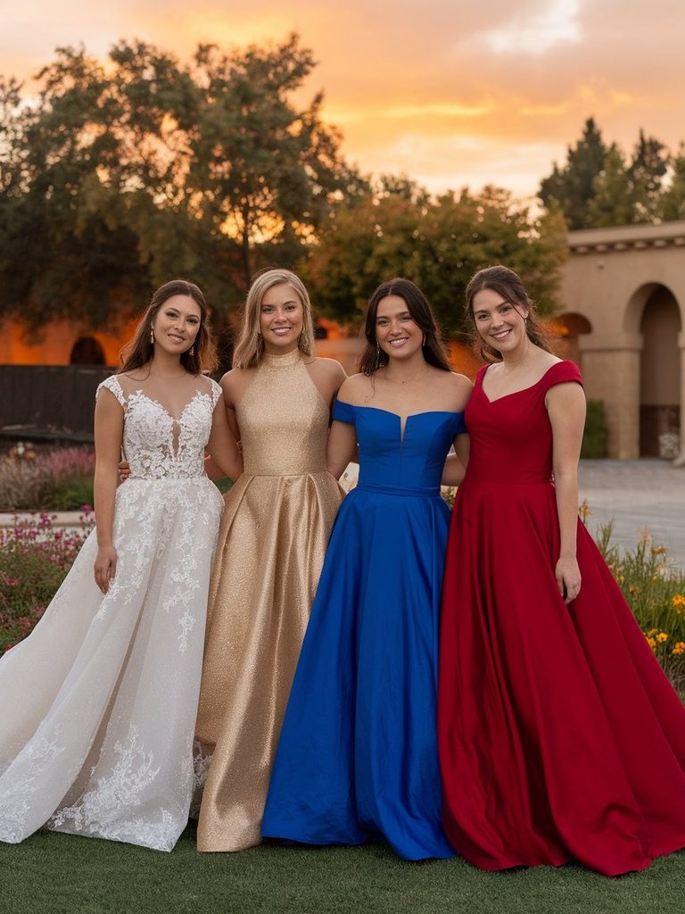
A decade ago, a colored wedding gown was mostly a second-look choice, something worn for the reception after the ceremony portraits were already done in white. That’s changed. Bridal designers now routinely offer their signature silhouettes in blush, champagne, sage, and dusty blue as first-look options, not just as add-ons.
Part of this comes from social media making colored bridal looks far more visible than they used to be, but part of it is more practical. Brides with warmer skin often find that a true, cool-toned white can make their complexion look sallow under certain lighting, in the same way some brides with fair, cool undertones find that ivory washes them out rather than warming them up. A dress with actual pigment in it sidesteps that problem entirely, since the color is chosen to work with the skin rather than simply being the default.
There’s also a simpler reason: color gives a gown a personality that white sometimes doesn’t. A champagne slip dress reads differently from a stark white ball gown before either one is even styled, and for brides who want their dress to feel distinctly theirs, that difference matters.
Undertone Still Runs the Show
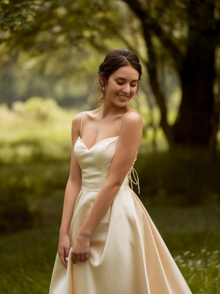
The same undertone logic that shapes flattering makeup shades, jewelry metals, and even hair color also applies to wedding dress fabric, and it matters more here than in most other clothing choices because a wedding dress sits so close to the face and is photographed under such a wide range of lighting.
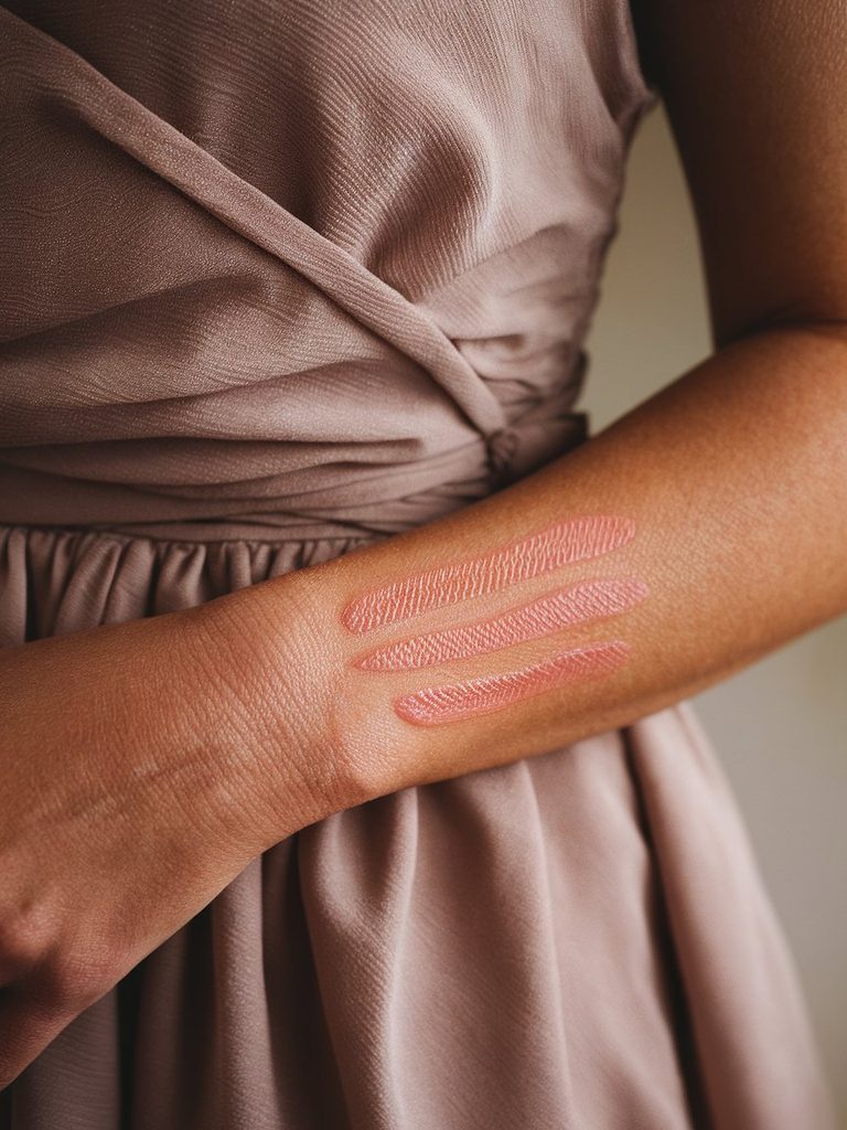
Warm undertones carry a golden or peachy base under the skin. Cool undertones lean pink, red, or slightly blue. Neutral undertones sit in between and generally have more flexibility with either direction. If a bride already knows her undertone from choosing foundation shades or jewelry, that same read carries over directly to dress color. If not, checking the vein color on the inner wrist is a reasonably reliable shortcut: blue or purple veins usually point toward cool, green points toward warm, and a mix of both usually means neutral.
What’s different about applying this to a wedding dress specifically is scale. A ring or a lipstick shade sits in a small, contained area. A dress covers the torso and often catches light from every angle in a way that magnifies whichever direction, warm or cool, the fabric leans. A slightly miscalculated undertone match is far more noticeable across yards of fabric than it is in a single accessory.
Best Wedding Dress Colors for Warm Skin Tones
Warm undertones tend to look most luminous in shades that share that same golden base rather than fighting against it with something stark or icy.
Ivory and warm champagne work better here than a true, bright white, since both carry enough cream and gold to echo the warmth already in the skin instead of creating contrast against it. Blush with a peachy lean, rather than a cooler, bubblegum pink, tends to look like an extension of warm skin rather than a color placed on top of it. Soft honey and warm gold shades, increasingly popular for evening receptions, flatter warm undertones especially well in golden-hour light, which is exactly when most wedding photography happens anyway.
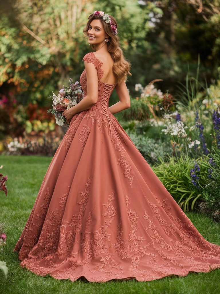
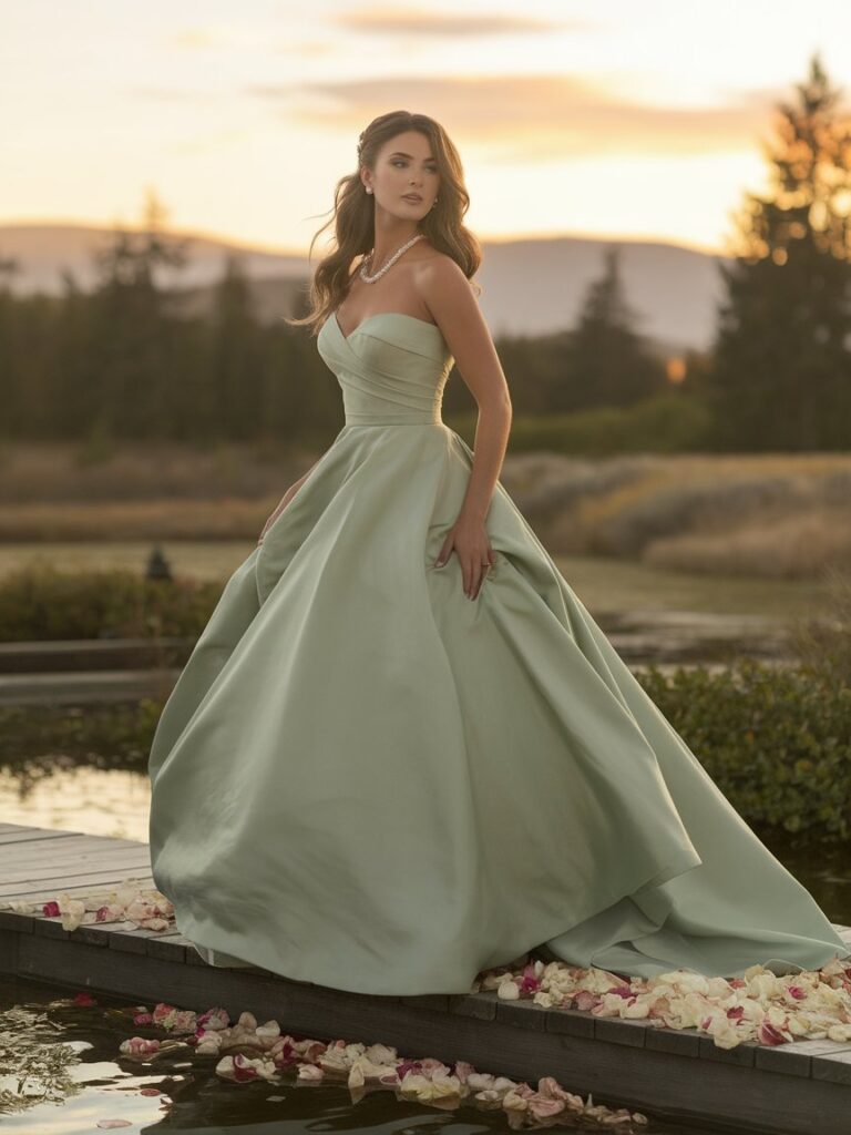
For brides drawn to a bolder statement, terracotta, rust, and warm burnt orange gowns have started appearing more often at fall weddings, and they suit warm undertones in the same way they suit warm-toned bridesmaid palettes: the earthy pigment matches the skin’s own base tone instead of competing with it. Sage and olive green, despite reading as cool colors at a glance, actually carry a yellow undertone that leans warm, which is part of why sage has become such a popular choice for garden and outdoor ceremonies among brides with golden skin.
Brides with warm undertones generally want to be more cautious with icy, blue-based whites and very cool pastels like lavender or baby blue, which can sometimes create a slightly flat or washed-out effect against golden skin, especially in bright, direct sunlight.
Best Wedding Dress Colors for Cool Skin Tones
Cool undertones respond best to shades with a blue, silver, or purple base, even in colors that don’t look obviously cool at first glance.
Bright, true white, the classic cool-toned bridal shade, remains one of the most flattering options for this group precisely because it doesn’t fight against a pink or blue undertone the way it can on warmer skin. Icy champagne and platinum-beige shades give brides who want something softer than pure white a similarly cool-leaning alternative without losing that crispness. Dusty blue and soft periwinkle have become popular first-look colors for cool-toned brides who want a pastel gown, since both lean firmly toward blue rather than warming into lavender or grey.
For a deeper, more dramatic statement, emerald, deep teal, and jewel-toned sapphire gowns photograph beautifully on cool undertones, offering richness without the flatness that can happen when a cool jewel tone is worn against warm skin. Berry shades, plum, wine, and cool-leaning burgundy, work the same way a blue-based red lipstick does: the underlying pigment matches the skin instead of competing with it.
Cool-toned brides generally want to be more careful with warm ivory, peachy blush, and golden champagne, all of which can sometimes read as slightly dull or mismatched against pink or blue-leaning skin, particularly under warm indoor lighting.
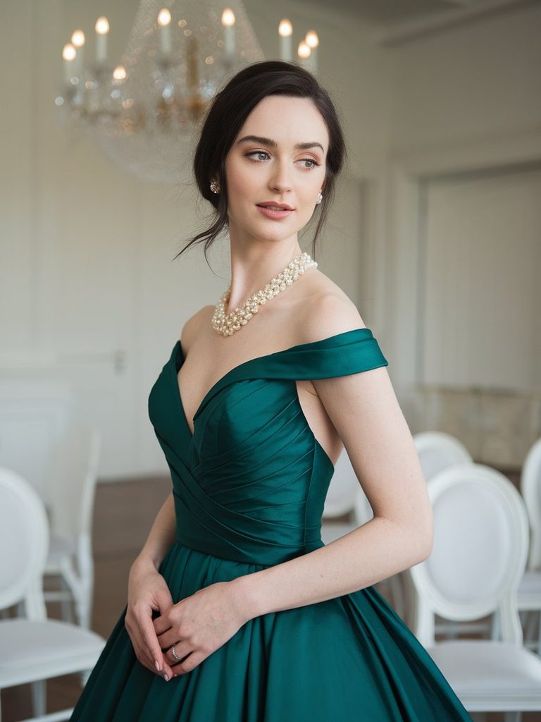
Best Wedding Dress Colors for Deep Skin Tones
Deep skin tones have the most range of any group when it comes to colored wedding gowns, largely because rich, saturated colors read as vivid rather than washed out against deeper complexions, something pale pastels often struggle to do.
Deep jewel tones, emerald, sapphire, and rich amethyst, tend to look extraordinary against deep skin, creating real contrast and vibrancy rather than blending in the way the same shades sometimes do on lighter complexions. Gold and metallic champagne gowns also have a particular glow against deep skin, since the shimmer catches and reflects light in a way that a flat, matte pastel usually can’t. Rich burgundy and deep wine read as elegant rather than heavy on deep undertones, especially in satin or silk fabrics that let the color’s depth show through.
Where deep skin tones need slightly more care is with very pale, low-saturation pastels, baby pink, pale lavender, or a barely-there blush, which can sometimes look chalky or flat against deeper complexions rather than soft and romantic the way they read on fair skin. This isn’t a hard rule; a pastel in a warmer, richer version, like a dusty rose instead of a cotton-candy pink, usually solves the problem by adding back some of the depth a paler version lacks. Ivory, particularly a warm or golden ivory rather than a stark, cool white, remains a consistently flattering neutral choice for deep skin, offering the softness of a traditional bridal shade without the flatness a bright white can sometimes create.
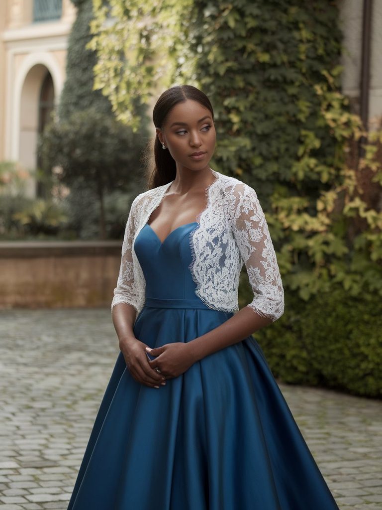
Best Wedding Dress Colors for Fair Skin Tones
Fair skin, particularly when paired with a cool or neutral undertone, tends to do well with a wide range of pastels and jewel tones, but contrast becomes the deciding factor more than undertone alone.
Soft blush, dusty rose, and pale champagne are reliably flattering on fair skin, since these shades are close enough to the skin’s own depth that they read as an elegant, monochromatic effect rather than a jarring contrast. Sage green and soft sage-grey work particularly well on fair, cool-leaning skin, offering enough color to feel intentional without overwhelming a lighter complexion. For brides who want more drama, navy and deep burgundy create striking contrast against fair skin without the starkness that a very saturated, bright jewel tone can sometimes bring.
Very pale, low-contrast pastels, think the softest possible lavender or the faintest ballet pink, can occasionally wash out fair skin if the depth of the dress color sits too close to the depth of the skin itself, particularly under bright, overexposed lighting. This is less about the color family and more about value and saturation. A fair-skinned bride who loves a pale palette generally does better choosing the more saturated end of that color range rather than the palest version of it.
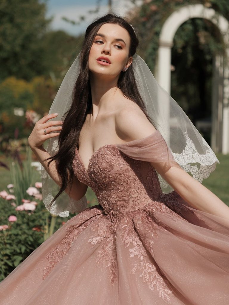
Choosing Between a Subtle Tint and a Bold Statement Color
Beyond matching a shade to undertone, there’s a separate decision about how much color to actually commit to, and this often matters as much as the undertone match itself.
A subtly tinted gown, a blush that reads as nearly white from a distance, or a pale sage that only shows its color up close, gives a bride most of the traditional bridal silhouette with a warmer or cooler cast that flatters her specific skin. This approach tends to suit brides who want the benefit of a more flattering shade without a dramatic visual departure from a classic white wedding look, and it also tends to photograph more predictably across different lighting conditions than a highly saturated color would.
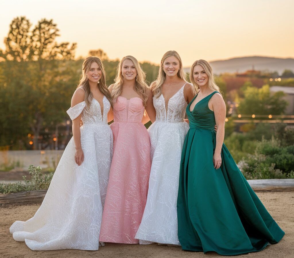
A bold statement color, a deep emerald ball gown or a rich burgundy slip dress, makes a far more decisive style statement and works particularly well for brides having a second dress for the reception, an evening ceremony, or a wedding with a strong color theme already built into the florals and décor. Bold colors also tend to benefit more from fabric with some sheen, satin or silk rather than a flat crepe, since the shine helps the color read as rich rather than matte and heavy in photographs.
Neither approach is inherently more flattering than the other. The choice comes down to how much visual departure from tradition a bride actually wants, balanced against how the venue’s lighting and the wedding’s overall color palette will interact with a more saturated shade.
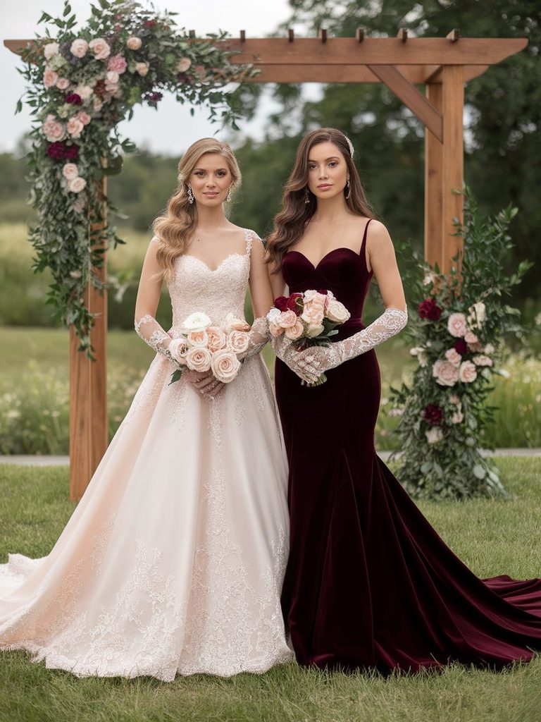
How Lighting and Venue Change a Color’s Final Look
The same undertone logic that applies to a fabric swatch held under a store’s lighting doesn’t always hold once that same dress is worn at an actual venue, particularly for outdoor and golden-hour ceremonies.
Warm, late-afternoon sunlight intensifies golden and peachy tones and can slightly mute cooler colors, which is worth factoring in for a bride choosing a jewel-toned gown for an outdoor evening ceremony. Indoor venues lit primarily with warm, incandescent bulbs have a similar effect, casting a golden tint across the whole scene that flatters warm-leaning dress colors more than cool ones. A venue with cooler, more neutral lighting, whether that’s overcast daylight or fluorescent interior lighting, tends to do the opposite, letting cool jewel tones and blues read closer to true while slightly muting warm shades.
None of this means a bride needs to abandon a color she loves because of where the wedding happens, but it’s worth requesting an actual fabric swatch and, where possible, holding it up in lighting similar to the ceremony space before finalizing a custom order, particularly for a gown that can’t easily be exchanged once made.
Getting the Undertone Match Right Before Ordering
A digital photo of a dress rarely captures its true color, and screens across different phones and computers render the same shade inconsistently enough that relying on an online listing alone is one of the most common ways a bride ends up disappointed with the final gown.
Ordering a physical fabric swatch, most bridal boutiques and custom designers offer this for a small fee or as part of a fitting, remains the most reliable way to judge how a color actually performs against a specific complexion. Holding the swatch in natural daylight, away from a store’s overhead lighting, gives a truer read than testing it only indoors. Comparing two or three closely related shades side by side rather than evaluating just one in isolation also makes subtle differences, like the gap between a warm ivory and a true white, much easier to see than judging a single swatch on its own.
For brides working with a bridal stylist or designer directly, bringing a few reference photos of the specific shade in natural light, rather than relying on a single studio photo from the designer’s own website, tends to produce a more accurate final result, especially for custom or made-to-order gowns where changes after the fact aren’t simple.
Common Mistakes When Choosing a Colored Wedding Dress
A handful of recurring missteps tend to show up regardless of which color a bride ultimately chooses.
- Choosing a shade because it looked stunning on someone else. A color that flattered a friend or an influencer with a different undertone will not necessarily translate the same way on a different complexion.
- Relying entirely on a screen to judge the shade. Monitor and phone calibration vary enough that a color can look noticeably different once it arrives as fabric.
- Ignoring the venue’s lighting until the wedding day itself. A shade that looked perfect under a boutique’s fitting-room lights can shift under a reception’s warm, low lighting.
- Assuming ivory is automatically safer than a true white. Ivory flatters warm undertones but can look dull rather than soft on some cool, fair complexions, which is the reverse of what many brides assume going in.
- Skipping a physical swatch for a made-to-order gown. This remains one of the most common reasons a custom dress color ends up looking different in person than it did in early consultations.
Making the Final Decision With Confidence
Choosing a wedding dress color ultimately comes down to balancing three things: how a shade reads against a bride’s own undertone, how much visual contrast or subtlety she actually wants, and how the venue’s lighting will treat that color once the day arrives. None of these factors work in isolation, which is why a color that looks perfect on a fabric swatch in a boutique doesn’t always translate directly to how it will photograph outdoors at sunset or under a reception’s string lights.
For brides who want the reassurance of tradition with a more flattering cast, a subtly tinted ivory, champagne, or blush usually offers the easiest transition away from stark white. For brides ready to make color a genuine part of their bridal identity, a well-matched jewel tone or rich neutral, chosen with undertone and venue lighting in mind rather than trend alone, tends to produce a look that feels intentional rather than experimental. Either way, the earlier a specific shade gets tested against actual skin in real lighting, the fewer surprises there are once the dress finally arrives.
Brides deciding on dress color often make hair and nail decisions around the same time, and it’s worth looking at bridal hairstyle inspiration and nail design ideas once a shade feels settled, since warm and cool dress colors tend to pair differently with metallic jewelry and hair color than most brides expect. For anyone also finalizing a neckline or silhouette alongside color, the guide to wedding dress necklines by body shape is a useful next stop, and brides curious about how different fabrics change the way a color performs may also want to read that alongside this one, since silk and satin can shift the same shade in noticeably different directions.

Ella is a fashion and beauty writer who shares inspiring ideas about hairstyles, nail designs, wedding outfits, and seasonal fashion trends. She loves discovering fresh styles and creating…
View Author Profile →