

On this page
- Why Some Neutral Outfits Look Expensive and Others Look Flat
- Warm Neutrals vs Cool Neutrals: The Combination That Actually Matters
- Tonal Dressing: One Color Family, Multiple Shades
- High-Contrast Neutral Pairings That Still Feel Sophisticated
- Texture as the Second Variable That Makes or Breaks a Neutral Outfit
- Neutral Combinations That Read Expensive
- The Role of Metal Tones and Accessories in a Neutral Outfit
- Adapting These Combinations Across Seasons
- Common Mistakes That Make Neutrals Look Cheap Instead of Expensive
- Building a Neutral Wardrobe Around These Combinations
Neutral dressing has a reputation problem. Done well, it looks like the kind of outfit that costs more than it did and takes less effort than it does. Done carelessly, it looks flat, tired, and a little like getting dressed was an afterthought. The difference rarely comes down to the individual pieces themselves. It comes down to which neutrals get paired together, and whether that pairing was actually planned.
Most people default to treating “neutral” as a single, interchangeable category, as if beige, grey, cream, and black all sit on the same wavelength and can be combined without much thought. In practice, neutrals split into distinct families with their own undertones, and mixing across those families without a plan is exactly what makes so many neutral outfits look cheaper than they are. This guide breaks down which neutral pairings actually read as expensive, and why a few small adjustments make such a visible difference.
Why Some Neutral Outfits Look Expensive and Others Look Flat
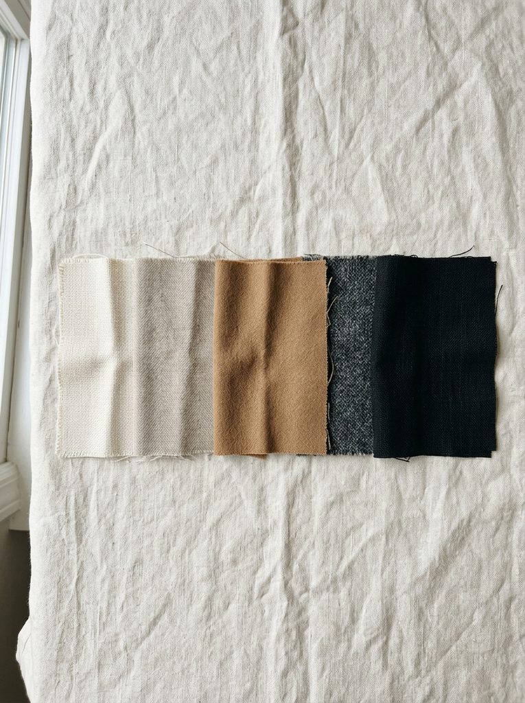
An outfit built entirely from neutral colors relies on contrast and texture to do the work that a bold color or pattern would otherwise handle. When that contrast is missing, the whole look can read as flat rather than deliberate, since there is nothing for the eye to register beyond a single wash of similar tone.
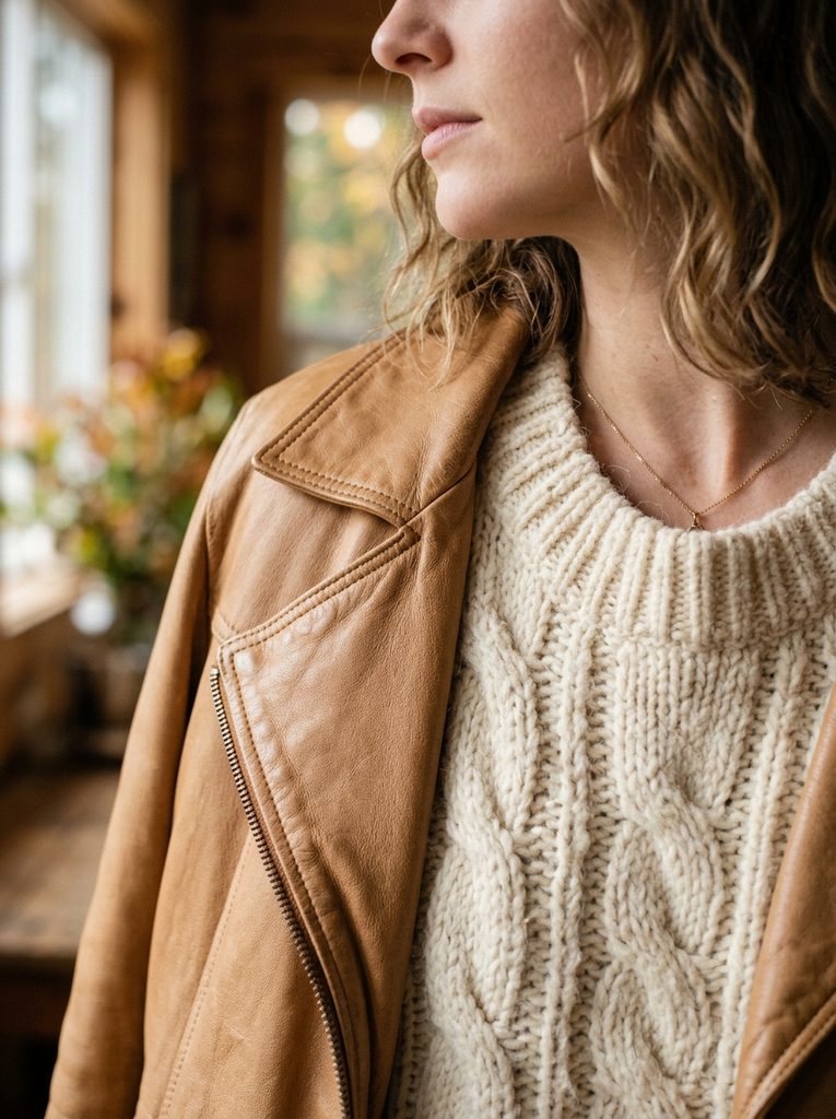
The most expensive-looking neutral outfits tend to use a narrow but intentional range of tone within the same undertone family, then introduce contrast through texture, fabric weight, or a slight shift in depth rather than through a completely different color. A camel coat over a cream sweater reads as considered because both pieces share a warm undertone while still creating enough tonal difference to look layered rather than monochrome by accident.
The flat, cheaper-looking version of the same idea usually happens when warm and cool neutrals get combined without noticing, or when every piece sits at nearly identical value with no depth variation at all. Both mistakes are common, and both are easy to fix once the underlying issue is visible.
Warm Neutrals vs Cool Neutrals: The Combination That Actually Matters
Almost every neutral color leans slightly warm or slightly cool, even when it looks fairly plain at first glance. Recognizing which side a given neutral falls on matters more than almost any other styling decision in a neutral-based outfit.
Warm Neutral Family
Camel, tan, warm beige, cream, chocolate brown, and a soft ivory all carry a golden or yellow undertone beneath the surface color. These shades tend to photograph well in natural and warm indoor lighting and pair easily with gold hardware and warm-toned leather.
Cool Neutral Family
True grey, cool white, taupe with a pink or blue cast, charcoal, and black all sit on the cooler side of the spectrum. These shades tend to look crisper and more graphic, and they pair more naturally with silver hardware and cooler-toned accessories.
Why Mixing Warm and Cool Without a Plan Backfires
A warm camel coat paired with a cool, blue-grey sweater does not clash in an obvious way, the two colors are not competing for attention the way a bold red and orange might, but the outfit still tends to look slightly off. The undertones pull against each other quietly, which often reads as “something is not quite right” rather than an obvious styling mistake. This is one of the most common reasons a neutral outfit looks less expensive than the individual pieces actually are.
Staying within one undertone family for the majority of an outfit, then using the opposite family sparingly and intentionally, usually solves this problem without requiring an entirely new wardrobe.

Tonal Dressing: One Color Family, Multiple Shades
Tonal dressing, building an outfit from several shades within the same color family rather than a single flat block of one color, is one of the most reliable ways to make neutrals look expensive rather than plain.
A cream turtleneck under a camel coat with tan trousers uses three distinct depths of the same warm neutral family, which creates visual interest through value and texture rather than competing colors. The same logic works in the cool neutral family: a charcoal sweater, mid-grey trousers, and a black coat create layered depth without introducing a single new color into the mix.
This approach photographs particularly well because it avoids the flat, one-note look of wearing a single shade head to toe, while still keeping the overall palette calm and cohesive. It also tends to elongate the silhouette, since there are no strong horizontal breaks in color the way a two-tone outfit with sharp contrast might create.

High-Contrast Neutral Pairings That Still Feel Sophisticated
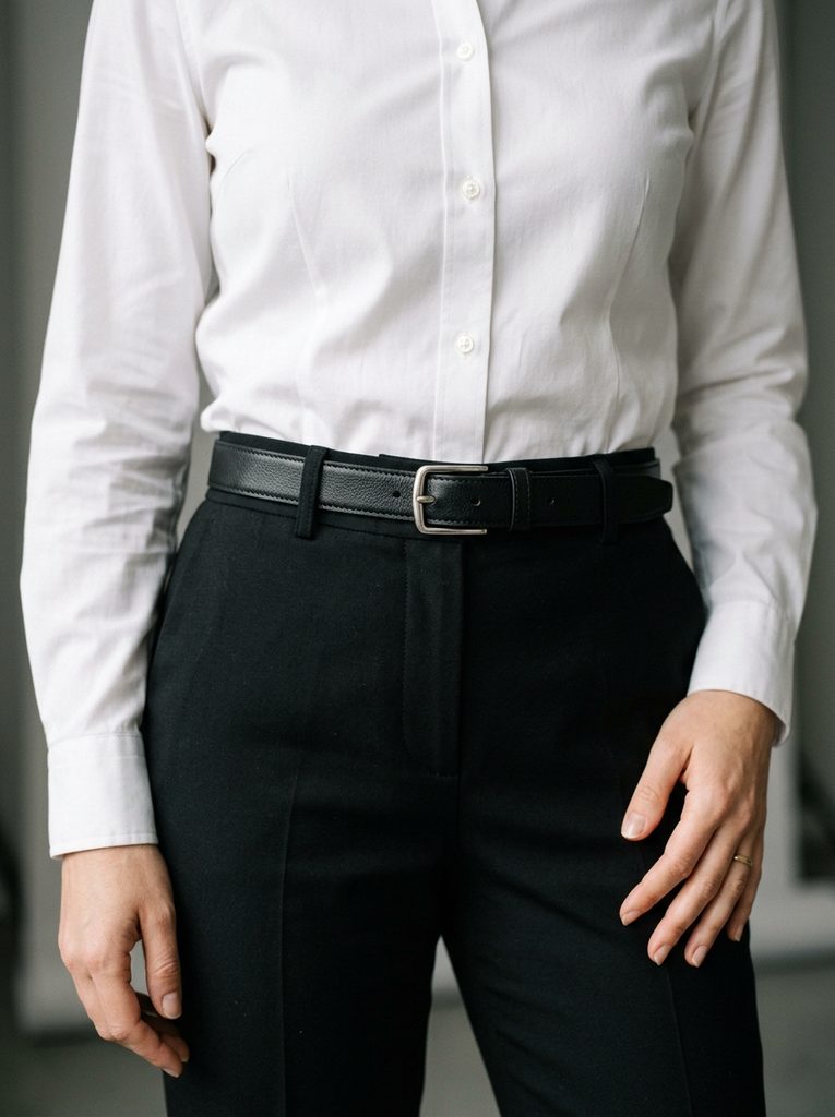
Not every expensive-looking neutral outfit relies on tonal blending. A higher-contrast pairing, like crisp white against black or deep charcoal against cream, can look just as polished when the contrast is controlled and intentional rather than accidental.
The difference between a sophisticated high-contrast neutral outfit and a flat, generic one usually comes down to proportion and finish. A crisp white shirt against tailored black trousers reads as sharp and considered, while a slightly off-white, slightly aged-looking white against a faded black can look mismatched rather than intentionally graphic. Committing to a true, clean version of each color, rather than two shades that were each meant to be neutral but do not actually match in undertone or depth, keeps a high-contrast neutral pairing from tipping into looking careless.
Ivory against a rich chocolate brown works on a similar principle within the warm neutral family, offering visible contrast without introducing a cool tone that would fight against the rest of the palette.
Texture as the Second Variable That Makes or Breaks a Neutral Outfit
Color alone rarely does all the work in a neutral outfit. Texture and fabric finish carry nearly as much visual weight, particularly once color variation is intentionally kept minimal.
A matte wool coat over a slightly sheened silk blouse in the same tonal family creates depth through material contrast rather than color contrast, which reads as more considered than pairing two flat, similarly finished fabrics in the same shade. Cashmere, suede, and a soft leather all bring a tactile richness that plain cotton or a stiff polyester blend does not, which is part of why the same beige outfit can look noticeably more expensive in one fabric combination than another, even with an identical color palette.
Mixing at least two distinct textures within a neutral outfit, a smooth leather bag against a chunky knit, or a structured wool blazer over a soft, draping trouser, tends to prevent the flat, one-dimensional look that plagues so many all-neutral outfits built from similar fabric weights throughout.
Neutral Combinations That Read Expensive
A handful of specific pairings consistently photograph well and read as intentional rather than default.
- Camel and chocolate brown, both from the warm neutral family, create depth through tonal contrast while staying cohesive. Adding a cream layer underneath softens the combination further.
- Ivory and taupe, particularly a warm-leaning taupe, offers a quieter version of the same principle, well suited to daytime and office settings where a bolder brown might feel too casual.
- Charcoal and cool grey, worn together in a blazer and trouser combination, reads as sharp and put-together without needing black at all, which can feel slightly softer for daytime wear.
- Black and cream, a classic high-contrast pairing, works particularly well when the cream piece has some texture or sheen, since a completely flat, matte cream against black can look slightly stark rather than elegant.
- Grey and navy, technically a neutral paired with a deep, muted blue, reads as sophisticated and slightly unexpected compared to the more common grey-and-black pairing, while still staying firmly within a controlled, low-key palette.
The Role of Metal Tones and Accessories in a Neutral Outfit
Jewelry and hardware finish matter more in a neutral outfit than they might in a more colorful one, precisely because there is less color to distract from a mismatched metal tone.
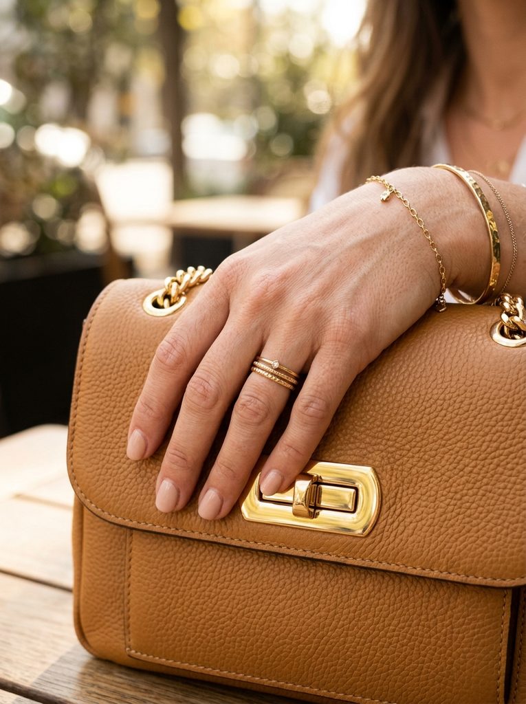
Gold jewelry and gold hardware on a bag or belt tend to reinforce a warm neutral outfit, echoing the same undertone already present in camel, cream, or chocolate brown pieces. Silver and other cool-toned metals do the same work for a grey, charcoal, or true black outfit, keeping the whole look consistent from clothing down to the smallest accessory.
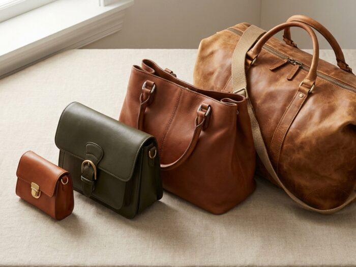
Choosing a handbag with this same undertone logic in mind is worth considering alongside the outfit itself, since a warm camel coat paired with a cool-toned silver-hardware bag can quietly undercut an otherwise well-planned neutral look. The handbag sizes guide covers how to think through a functional bag rotation, and pairing that rotation with an awareness of warm versus cool hardware tends to make a neutral wardrobe feel more cohesive overall.
Adapting These Combinations Across Seasons
The same undertone logic holds up year-round, but the specific shades and fabric weights worth reaching for shift depending on the season, which is part of why a neutral outfit that felt right in July can look slightly out of place by November without anyone quite knowing why.
Warm neutrals tend to deepen as the year moves toward autumn and winter, with camel giving way to a richer cognac or chestnut, and cream shifting toward a heavier oatmeal or warm ivory in a thicker knit. Cool neutrals follow a similar pattern, with a lighter dove grey common in spring and summer giving way to a deeper charcoal or a near-black slate once temperatures drop. The undertone family stays the same in either case. Only the depth and the fabric weight carrying that undertone actually change.
Fabric plays an even larger role in this seasonal shift than color depth does. A lightweight linen in warm beige reads as an entirely different outfit than a heavy wool coat in the exact same beige, even though the underlying color technically matches. Keeping this in mind when building out a neutral wardrobe across seasons helps avoid the common mistake of assuming a shade works everywhere simply because the color itself was verified once against a swatch or a single outfit.
Common Mistakes That Make Neutrals Look Cheap Instead of Expensive
A handful of recurring choices tend to undercut an otherwise well-intentioned neutral outfit.
- Mixing warm and cool neutrals without a clear intention. A beige coat over a cool grey outfit is the single most common way a neutral look ends up feeling slightly off, even when no individual piece looks wrong on its own.
- Staying at one flat value with no depth variation. An outfit built entirely from a single, identical shade of beige, with no lighter or darker layer anywhere, tends to look monotonous rather than sophisticated.
- Ignoring texture entirely. A neutral outfit built from the same flat, smooth fabric throughout misses one of the easiest ways to add visual interest without introducing color.
- Pairing mismatched metal tones. Gold jewelry against a cool-toned outfit, or silver against a warm one, creates the same quiet undertone clash that mixing warm and cool fabrics does.
- Choosing a slightly worn or dingy version of white or cream instead of a true, clean shade. A neutral that has faded or yellowed unevenly reads as tired rather than intentionally soft, particularly in photographs.
Building a Neutral Wardrobe Around These Combinations
Rather than buying neutral pieces at random and hoping they eventually work together, building a wardrobe with a small number of intentional combinations in mind tends to produce a far more cohesive, expensive-looking result with fewer total pieces.
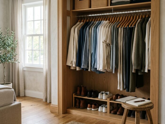
Start by choosing a dominant undertone, warm or cool, based on which family already makes up most of an existing wardrobe or which one tends to photograph better against your own skin. From there, build out two or three tonal layers within that family, along with one or two higher-contrast pieces for outfits that call for more visual definition. Keep metal tones and hardware consistent with the chosen undertone family, and prioritize at least one textural contrast, a knit against a structured fabric, or a matte piece against something with a slight sheen, in every outfit built from this palette.
This approach overlaps directly with the kind of thinking behind a well-planned seasonal capsule. The fall capsule wardrobe guide applies very similar undertone and layering logic to a full ten-piece rotation, and the office outfit formulas guide shows how a small, coordinated set of neutral pieces can stretch across a full work week without repeating the exact same look twice. For anyone building this kind of palette around their own coloring more specifically, the same undertone principles covered in the guide to choosing colors by skin tone apply just as directly to everyday neutral dressing as they do to picking out a dress color for a specific event.
Neutral dressing was never actually boring. It only looks that way when undertone, depth, and texture get ignored in favor of grabbing whatever beige or grey happens to be on hand. Paying attention to those three details consistently is what separates an outfit that reads as quietly expensive from one that reads as an afterthought, even when the individual pieces cost roughly the same either way.

Ella is a fashion and beauty writer who shares inspiring ideas about hairstyles, nail designs, wedding outfits, and seasonal fashion trends. She loves discovering fresh styles and creating…
View Author Profile →
1 Comment