

On this page
- Why the Same Dress Color Can Look Different on Every Bridesmaid
- Understanding Undertone Before Choosing a Palette
- Colors That Read Well on Warm Undertones
- Colors That Read Well on Cool Undertones
- Colors That Work Almost Universally
- Why Fabric and Finish Change How a Color Performs
- Building a Multi-Tone Palette Instead of One Single Color
- How Lighting and Venue Affect Color Perception
- Testing a Color Before Committing
- Common Color Mistakes That Undercut Photos
- A Simple Process for Choosing a Palette That Works for Everyone
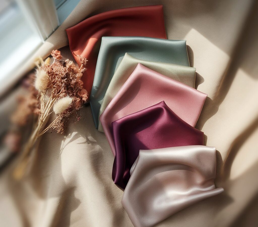
Picking a bridesmaid color often starts with a mood board and ends with a group chat full of second-guessing. A shade that looked perfect pinned next to florals and table linens can suddenly feel wrong once five or six different women try it on, and no two people in the group end up looking equally good in it. The color itself is rarely the real problem. The mismatch usually comes down to undertone, the warm or cool cast underneath the skin that changes how any given shade actually reads once it is worn.
This guide skips the usual approach of picking one trendy color and hoping for the best. Instead, it looks at how undertone works, which color families tend to flatter which undertones, and how to build a palette that lets every bridesmaid look like the best version of herself in the same set of photos.
Why the Same Dress Color Can Look Different on Every Bridesmaid
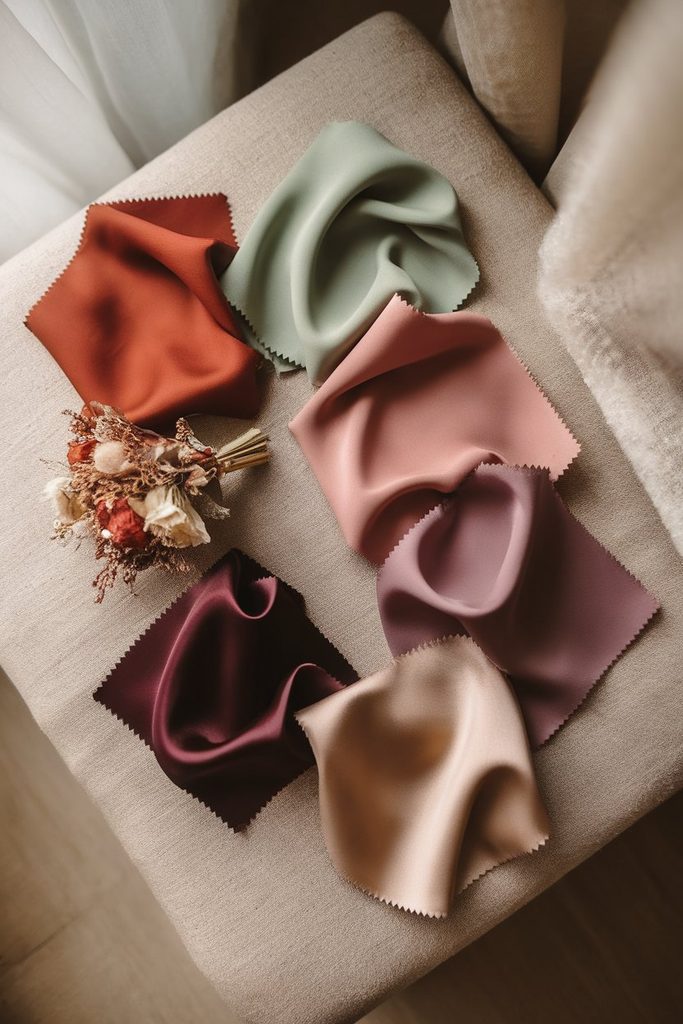
A single bottle of dye produces one fabric color, but that color is never seen in isolation. It sits next to skin, and skin has its own underlying tone that either harmonizes with a shade or fights against it. This is why a dusty rose can look radiant on one bridesmaid and slightly washed out on another, even though both women are wearing the exact same dress from the exact same order.
Undertone is different from surface skin color, which is why two people with similar depth of complexion can still need different shades. One might have a golden or peachy cast underneath, while the other leans pink or blue. Neither is more common or more limited than the other, but each responds better to a different part of the color wheel.
Wedding parties are rarely made up of people who share an undertone, which is exactly why a single, non-negotiable color often creates uneven results. Building a palette around undertone from the start solves this before the dresses are ever ordered, rather than trying to fix it with photo editing afterward.
Understanding Undertone Before Choosing a Palette
Before matching colors to people, it helps to get comfortable identifying undertone itself, since most of the guesswork in bridesmaid color selection comes from skipping this step entirely.
Warm Undertones
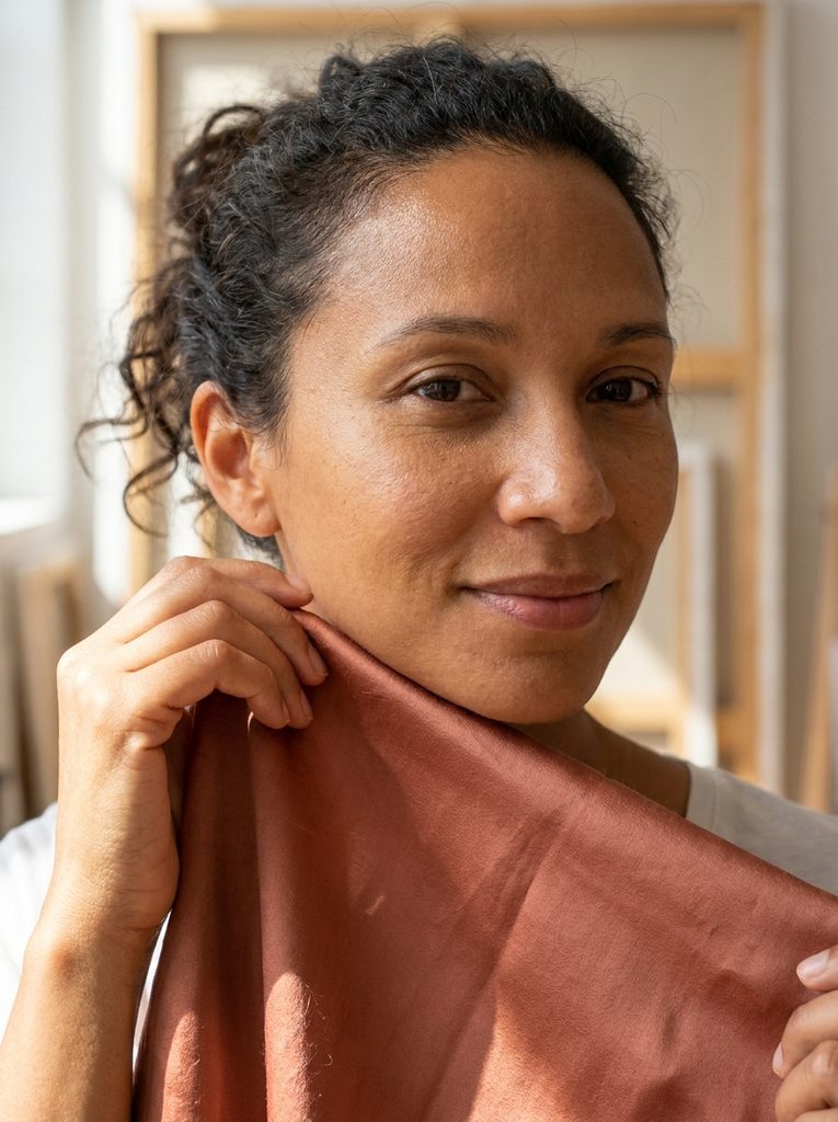
Warm undertones carry a golden, peachy, or yellow base beneath the skin. People with warm undertones often find that gold jewelry looks more natural against their skin than silver, and that earthy, golden-hued fabrics feel like an extension of their coloring rather than a color layered on top of it.
Cool Undertones
Cool undertones carry a pink, red, or bluish base. Silver and platinum jewelry tend to look more seamless against cool skin, and fabrics with a blue or purple cast tend to sit more naturally against this undertone than warm, yellow-based shades.
Neutral Undertones
Neutral undertones sit between the two, without a strong pull toward warm or cool. People with neutral undertones typically have more flexibility, since both warm and cool shades can look balanced, though very saturated or very muted versions of a color may still perform differently depending on the specific shade.
Quick Ways to Spot Undertone Without Guessing
A few simple checks tend to be more reliable than staring at a color chart:
- Vein color on the inner wrist. Blue or purple veins usually point to a cool undertone, while green veins suggest warm. Veins that look like a mix of both often indicate a neutral undertone.
- How the skin reacts to gold versus silver. Most people already know which metal they reach for instinctively, and that preference is a strong hint about undertone.
- Sun response. Skin that tans easily and rarely burns often leans warm, while skin that burns before it tans tends to lean cool, though this is a softer indicator than the other two.
None of these tests are perfectly scientific, but used together they give a reliable enough starting point for choosing a bridesmaid palette without needing a professional color analysis for an entire wedding party.
Colors That Read Well on Warm Undertones
Warm undertones tend to come alive next to colors that share that same golden base, rather than colors that pull toward blue or grey.
Terracotta and burnt orange work particularly well here, since the earthy warmth in the fabric echoes the warmth already present in the skin. Olive and moss green do the same thing in a cooler-looking color family, because both shades carry a yellow base underneath the green rather than a blue one. Warm golden yellow, honey, and amber tones flatter warm undertones for the same reason, and they photograph especially well in natural, golden-hour light.
Deep, warm reds, the kind that lean toward brick or rust rather than a cool, blue-based red, also tend to suit warm undertones more naturally than a true, icy red would. Camel and warm taupe round out this group as neutral options that still carry enough warmth to feel intentional rather than flat.
Colors That Read Well on Cool Undertones
Cool undertones respond best to shades with a blue or purple base, even within colors that might not seem obviously “cool” at first glance.
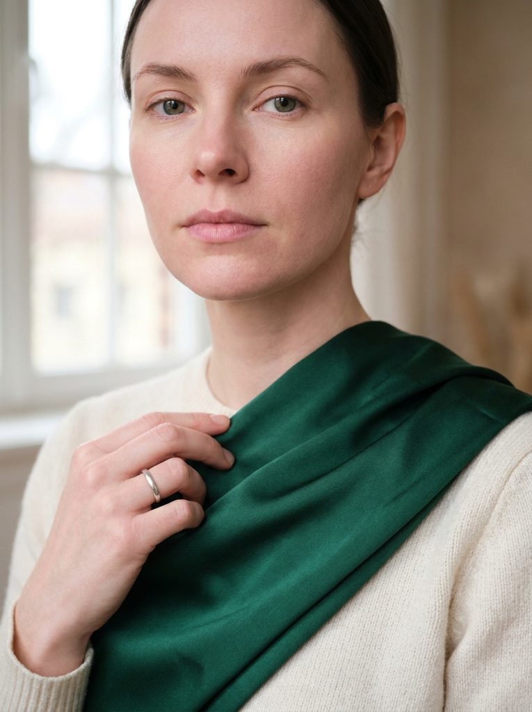
Emerald and jewel-toned teal both carry enough blue to sit comfortably against cool skin, and they tend to photograph as rich rather than washed out. True navy and a deeper cobalt blue work in a similar way, offering depth without pulling any warmth into the mix. Berry tones, plum, wine, and a cooler magenta, flatter cool undertones for the same reason a blue-based red does on its own: the underlying pigment matches rather than competes.
Soft lavender and dusty periwinkle are popular bridesmaid choices that specifically favor cool undertones, since both colors lean toward blue rather than pink at the base. A cooler, silvery grey also tends to look more polished on cool undertones than a warmer, beige-leaning grey would.
Colors That Work Almost Universally
A handful of colors sit close enough to the middle of the color wheel that they flatter both warm and cool undertones reasonably well, which makes them useful for a wedding party with a genuine mix of skin tones.
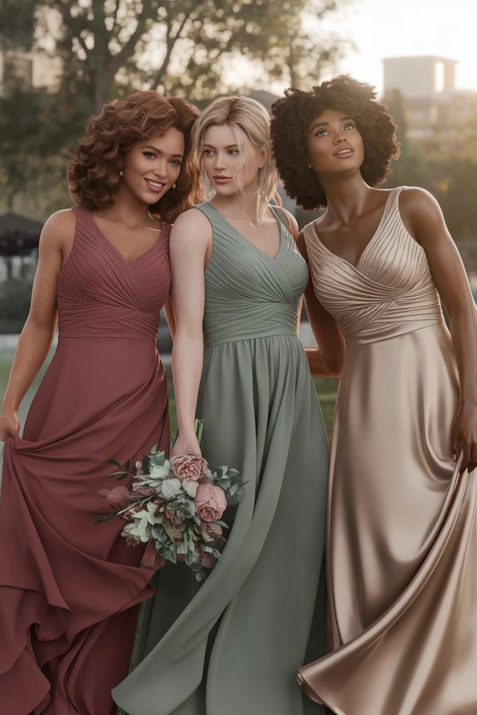
- Dusty rose in a muted, slightly warm-pink shade tends to flatter a wide range of undertones because it sits between a true pink and a soft coral.
- Sage green, unlike a more saturated forest green, often works across undertones since its muted, greyed-out quality softens the warm-versus-cool pull that a brighter green would otherwise have.
- Champagne and soft gold-beige shades tend to photograph well on most skin tones, particularly in natural light, since the warmth is subtle rather than intense.
- Deep burgundy, when it sits closer to the middle of the red spectrum rather than leaning sharply blue or orange, tends to suit a broader range of undertones than a brighter red would.
These universal shades are useful as a fallback when a wedding party spans several undertones and a single dress color is preferred over a mixed palette, though they still benefit from checking against fabric swatches in person before finalizing an order.
Why Fabric and Finish Change How a Color Performs
Color name and undertone theory only tell part of the story. The same shade can shift noticeably depending on the fabric it is printed or dyed onto.
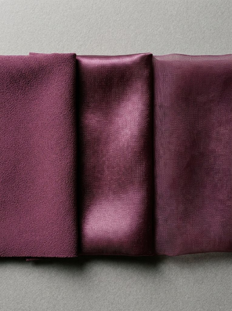
Matte fabrics like crepe and chiffon tend to hold true to the color as it appears on a swatch, since there is little shine to reflect surrounding light back onto the skin. Satin and other high-shine fabrics, by contrast, catch more ambient light and can throw subtle warm or cool reflections onto the face and neckline, which sometimes shifts how flattering a color feels for a specific undertone, even if the base shade is identical to a matte version.
Sheer overlays, like tulle or organza layered over a solid lining, can also lighten or soften the visible color compared to the same shade in a solid, opaque fabric. This matters most with pale or pastel shades, where a sheer layer can wash a color out further, sometimes making the shade read closer to a universal neutral than the vivid version on a fabric swatch would suggest.
Requesting a fabric swatch rather than relying only on a digital color preview remains the most reliable way to judge how a specific shade behaves once made into an actual dress, particularly when comparing similar tones like teal and emerald or plum and burgundy.
Building a Multi-Tone Palette Instead of One Single Color
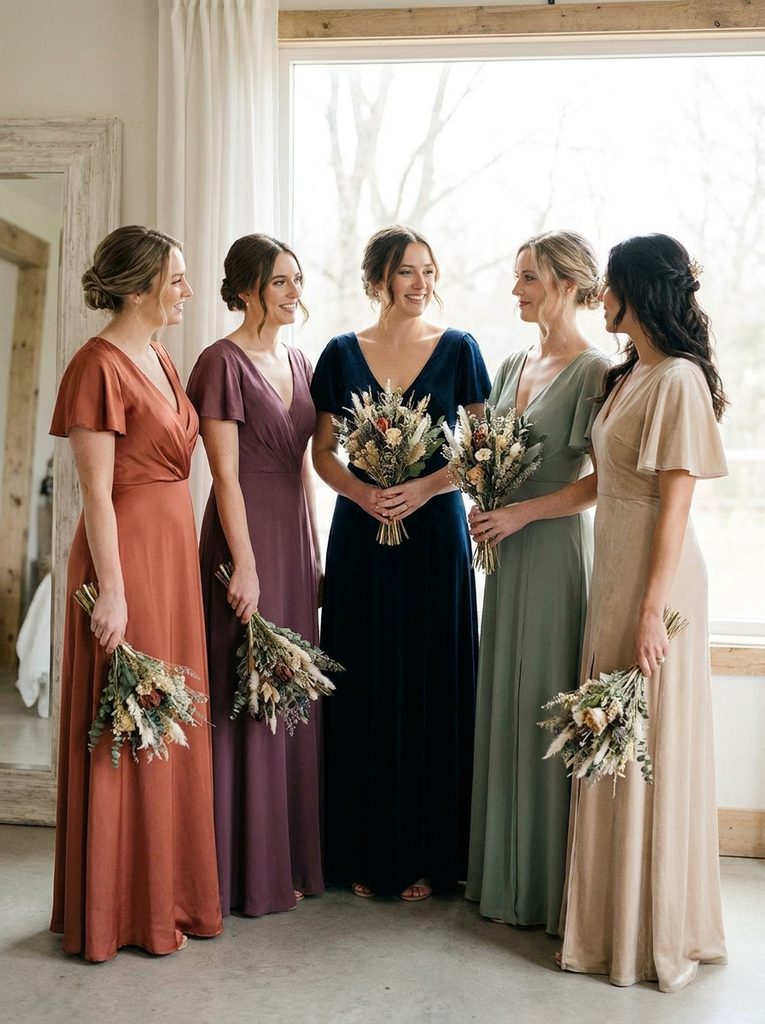
Rather than choosing a single bridesmaid color and hoping it flatters everyone equally, many wedding parties now build a coordinated palette that lets each bridesmaid choose the shade that suits her own undertone.
A palette built this way usually anchors around two or three related colors within the same family, rather than allowing entirely unrelated shades. A dusty rose, terracotta, and warm rust group works well for parties with mostly warm undertones, while a plum, navy, and deep teal grouping suits a group leaning cooler. For a genuinely mixed group, pairing a warm shade like terracotta with a cool shade like teal, connected by a shared neutral like champagne, keeps the overall look coordinated without forcing every bridesmaid into the same undertone-specific color.
This approach also gives more flexibility around body type and personal preference, since bridesmaids can be assigned or allowed to choose the shade that suits their own coloring and comfort rather than compromising on a single shade that may only flatter part of the group. For anyone finalizing a bridal look alongside this decision, browsing wedding dress silhouettes and details at the same stage can help keep the overall wedding party palette visually connected to the bride’s gown, particularly around fabric weight and finish.
How Lighting and Venue Affect Color Perception
Color does not exist independently of light, and the venue itself plays a real role in how a chosen palette will actually appear in photographs.
Outdoor, golden-hour ceremonies tend to intensify warm colors and can slightly mute cooler ones, which is worth factoring in when a couple is drawn to jewel tones for an evening garden wedding. Indoor venues with warm, incandescent lighting have a similar effect, adding a golden cast across the board that flatters warm-leaning shades more than cool ones. Venues with cooler, fluorescent, or heavily shaded natural light do the reverse, muting warm colors slightly while letting cool jewel tones and blues read a little more vivid than they might elsewhere.
None of this means a couple needs to abandon a color they love because of the venue, but it is worth requesting a fabric swatch and, where possible, viewing it in the actual ceremony or reception space, or at least in similar lighting, before finalizing an order for the entire wedding party.
Testing a Color Before Committing
A digital swatch or a small paint chip rarely tells the full story, particularly once an order needs to go out to several bridesmaids with different undertones and skin depths.
Ordering physical fabric swatches, most bridal retailers offer these for a small fee, allows each bridesmaid to hold the actual material near her face in natural daylight, which remains one of the most reliable ways to judge fit. Comparing two or three closely related shades side by side, rather than evaluating a single option in isolation, also makes subtle undertone differences easier to spot than looking at one swatch alone.
Taking a quick, unfiltered photo of each bridesmaid holding the swatch near her face can help when comparing notes across a group that is not able to test swatches together in person. Filters and heavy photo editing tend to shift color enough to make this step less useful, so keeping the test photo as close to natural as possible matters more than the photo looking polished.
Common Color Mistakes That Undercut Photos
A few recurring choices tend to create uneven results across a wedding party, even when the color itself is a popular, well-reviewed choice.
- Choosing a color based on how it looked on one specific person. A shade that looked stunning on a friend, an influencer, or even the bride herself will not necessarily translate the same way once it sits against a different undertone.
- Relying only on a screen to judge color. Monitors and phone screens render color inconsistently, so a shade that looks perfect in a digital mockup can shift noticeably once it arrives as an actual dress.
- Ignoring how a color performs under the venue’s specific lighting. A shade tested only under bright daylight can look completely different under warm evening reception lighting.
- Assuming a single “flattering neutral” works for every undertone. Even neutrals like beige, grey, and taupe have warm and cool versions, and picking the wrong one can look just as mismatched as a bold, saturated color would.
- Skipping a physical swatch entirely. This remains the single most common reason a bridesmaid color ends up looking different in person than it did during planning.
A Simple Process for Choosing a Palette That Works for Everyone
For couples who want a more structured approach rather than picking a color and hoping it works, a short process tends to produce more consistent results across the entire wedding party.
Start by asking each bridesmaid to identify her undertone using the quick checks outlined earlier, rather than guessing from memory or comparing against someone else in the group. From there, group the wedding party into warm, cool, and neutral clusters, even informally, to see how the group actually breaks down before committing to a single shade or a coordinated palette.
Next, shortlist two or three colors within the same general family that suit the dominant undertones in the group, leaning on a universal shade as a bridge color if the group is genuinely mixed. Order physical swatches for the shortlisted options and view them in natural light, ideally on or near each bridesmaid’s actual skin rather than only against a table or a wall.
Once a final palette is set, consider how it interacts with the rest of the wedding-day look, including hair and nails, since a warm terracotta dress pairs differently with an updo or a set of nails than a cool plum shade would. The bridal hairstyle and nail inspiration collections are useful starting points once the color direction feels settled, since coordinating these details tends to matter more to how photos read than most couples expect going in.
Choosing bridesmaid colors around undertone rather than trend alone takes a little more planning upfront, but it consistently produces photos where every member of the wedding party looks like she was dressed with her own coloring in mind, rather than squeezed into a shade chosen for the mood board instead of the people wearing it.

Ella is a fashion and beauty writer who shares inspiring ideas about hairstyles, nail designs, wedding outfits, and seasonal fashion trends. She loves discovering fresh styles and creating…
View Author Profile →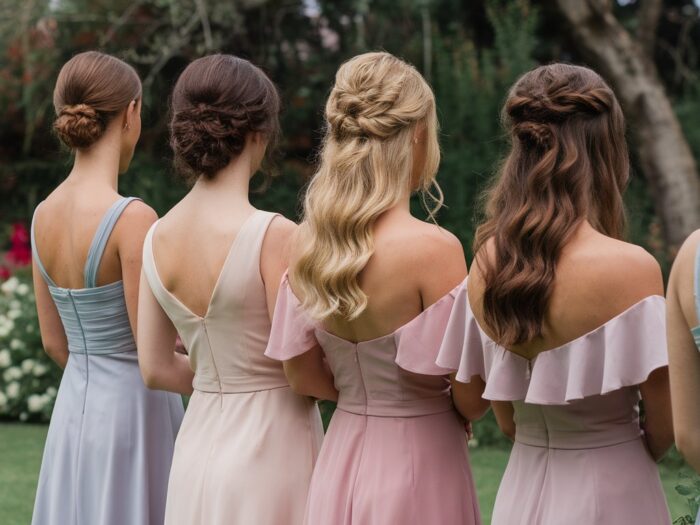
3 Comments